為網站添加網頁加載動畫
網頁加載的時候先顯示一個動畫,等加載完成后,再顯示網頁,這樣做過度比較自然。用戶體驗感比較好。
原理
原理是,給網頁頂部放一個元素,元素占滿全屏,加載完成后,再通過JS移除這個元素即可。
簡單在網頁頂部寫個代碼,一個div,作為容器,然后設置樣式,給占滿全屏。
<style>
    .loading-animations {
        background: #666;
        position: fixed;
        left: 0;
        right: 0;
        top: 0;
        bottom: 0;
        z-index: 9999;
    }
</style>
<div class="loading-animations" id="loading-warp"></div>
接下來,監聽網頁事件,加載完成后,給移除他,或者設置樣式display為none。
網頁加載完成事件有window.onload,但是這個要覆蓋其他的方法,所以使用監聽器最好
    window.addEventListener('load', function () {
        let loader = document.getElementById("loading-warp");
        loader.style.display = "none"
    });
效果如下:
看得出來,比較生硬。并且沒有任何東西,就是全屏展示,然后等待網頁加載完消失。
這個時候,修改一下樣式。給網頁添加一個漸變效果,在消失的時候,緩慢消失。
修改上面的style,加入了一個transition動畫,和opacity透明度。默認為1
    .loading-animations {

        background: #666;
        position: fixed;
        left: 0;
        right: 0;
        top: 0;
        bottom: 0;
        z-index: 9999;
        transition: 1s;
        opacity: 1;
    }

    .loading-animations-out {
         opacity: 0;
    }
等網頁加載完成后,給元素添加上loading-animations-out類,就可以實現漸變消失。
消失以后,等待1秒,將元素移除即可。
 window.addEventListener('load', function () {
        let loader = document.getElementById("loading-warp");
        loader.className = "loading-animations loading-animations-out";//使用漸隱的方法淡出loading page
        setTimeout(() => {
            loader.style.display = "none"
        }, 1000);
    });
那么,實現效果會這樣
進階
都這么做了,那么再搞個加載圖就完事大吉了。
不過對于前端來說,使用圖片,會再一次請求服務器。用戶第一次訪問的時候,圖片可能加載不出來。所以,使用svg輸出內容,或者使用css動畫,最合適。
既然CSS動畫了,那就看一個網站吧:
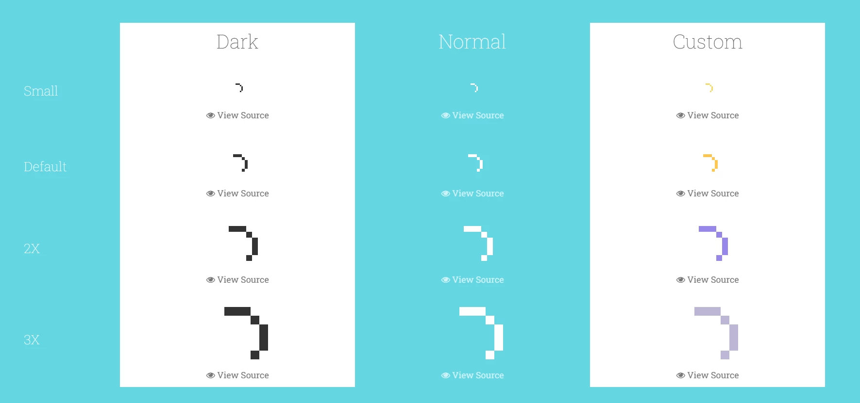
https://labs.danielcardoso.net/load-awesome/animations.html
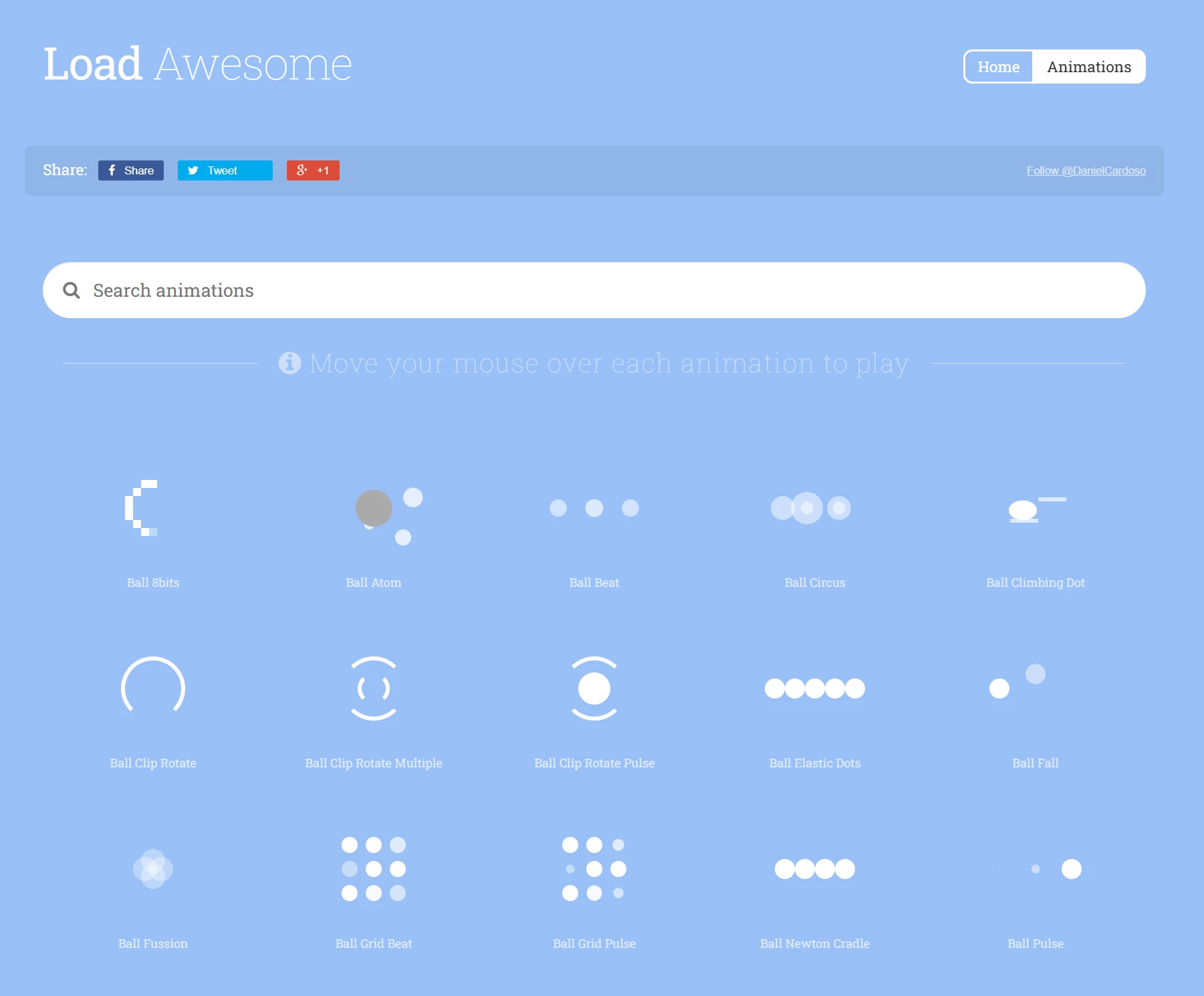
網站包含了很多CSS加載動畫,html內容和css內容都貼出來了。
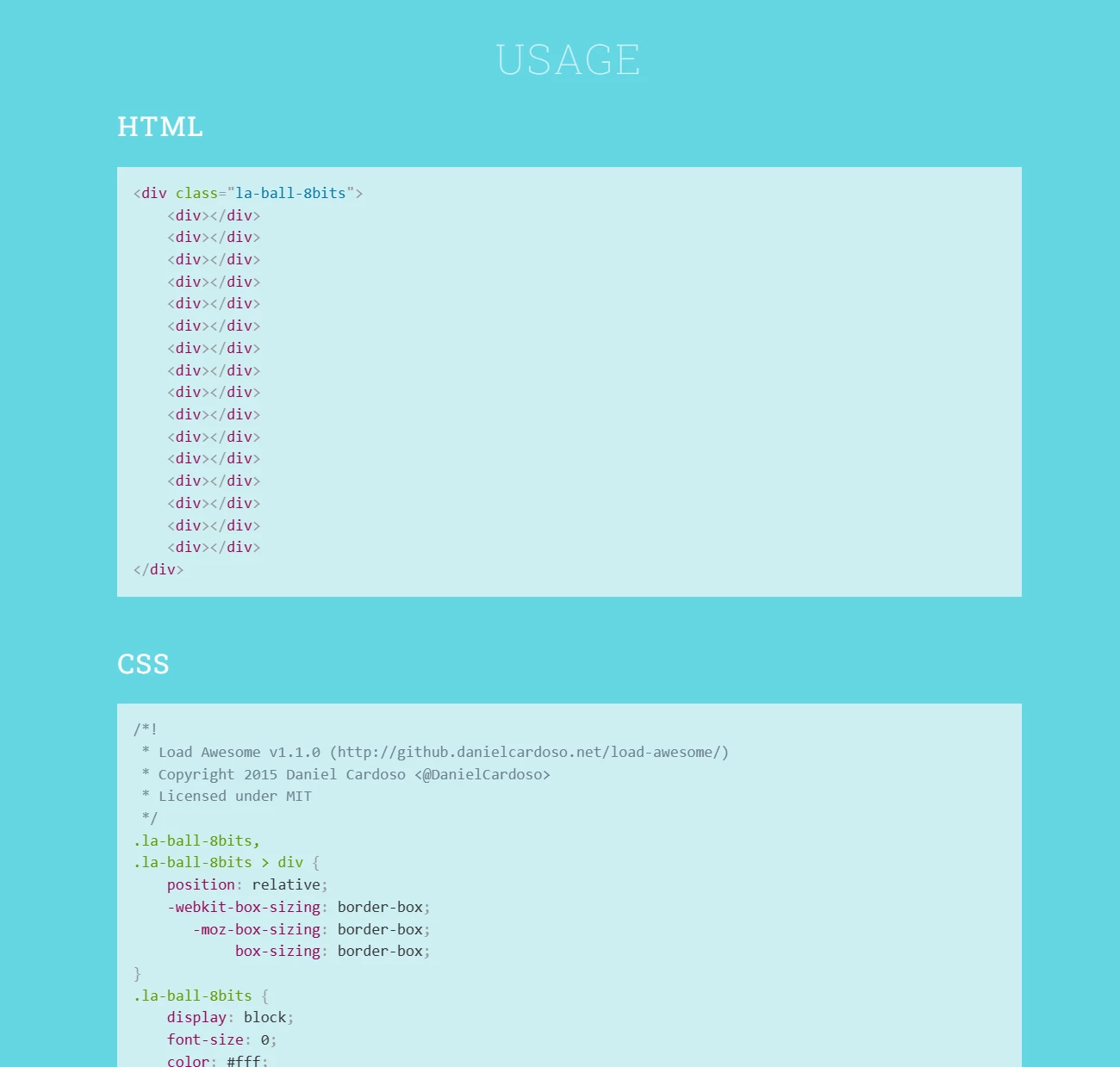
甚至還有不同樣式和大小的代碼
接下來,再修改代碼內容。
主要在樣式里面,將元素容器設置為flex,垂直居中。(選了一個簡單的動畫,不然代碼有點多。)
<style>
 .loading-animations
 {
 background: #666;
        position: fixed;
        left: 0;
        right: 0;
        top: 0;
        bottom: 0;
        z-index: 9999;
        display: flex;
        align-items: center;
        justify-content: center;
        transition: 1s;
        opacity: 1;
}
.la-ball-clip-rotate,
.la-ball-clip-rotate > div {
    position: relative;
    -webkit-box-sizing: border-box;
       -moz-box-sizing: border-box;
            box-sizing: border-box;
}
.la-ball-clip-rotate {
    display: block;
    font-size: 0;
    color: #fff;
}
.la-ball-clip-rotate.la-dark {
    color: #333;
}
.la-ball-clip-rotate > div {
    display: inline-block;
    float: none;
    background-color: currentColor;
    border: 0 solid currentColor;
}
.la-ball-clip-rotate {
    width: 32px;
    height: 32px;
}
.la-ball-clip-rotate > div {
    width: 32px;
    height: 32px;
    background: transparent;
    border-width: 2px;
    border-bottom-color: transparent;
    border-radius: 100%;
    -webkit-animation: ball-clip-rotate .75s linear infinite;
       -moz-animation: ball-clip-rotate .75s linear infinite;
         -o-animation: ball-clip-rotate .75s linear infinite;
            animation: ball-clip-rotate .75s linear infinite;
}
.la-ball-clip-rotate.la-sm {
    width: 16px;
    height: 16px;
}
.la-ball-clip-rotate.la-sm > div {
    width: 16px;
    height: 16px;
    border-width: 1px;
}
.la-ball-clip-rotate.la-2x {
    width: 64px;
    height: 64px;
}
.la-ball-clip-rotate.la-2x > div {
    width: 64px;
    height: 64px;
    border-width: 4px;
}
.la-ball-clip-rotate.la-3x {
    width: 96px;
    height: 96px;
}
.la-ball-clip-rotate.la-3x > div {
    width: 96px;
    height: 96px;
    border-width: 6px;
}
/*
 * Animation
 */
@-webkit-keyframes ball-clip-rotate {
    0% {
        -webkit-transform: rotate(0deg);
                transform: rotate(0deg);
    }
    50% {
        -webkit-transform: rotate(180deg);
                transform: rotate(180deg);
    }
    100% {
        -webkit-transform: rotate(360deg);
                transform: rotate(360deg);
    }
}
@-moz-keyframes ball-clip-rotate {
    0% {
        -moz-transform: rotate(0deg);
             transform: rotate(0deg);
    }
    50% {
        -moz-transform: rotate(180deg);
             transform: rotate(180deg);
    }
    100% {
        -moz-transform: rotate(360deg);
             transform: rotate(360deg);
    }
}
@-o-keyframes ball-clip-rotate {
    0% {
        -o-transform: rotate(0deg);
           transform: rotate(0deg);
    }
    50% {
        -o-transform: rotate(180deg);
           transform: rotate(180deg);
    }
    100% {
        -o-transform: rotate(360deg);
           transform: rotate(360deg);
    }
}
@keyframes ball-clip-rotate {
    0% {
        -webkit-transform: rotate(0deg);
           -moz-transform: rotate(0deg);
             -o-transform: rotate(0deg);
                transform: rotate(0deg);
    }
    50% {
        -webkit-transform: rotate(180deg);
           -moz-transform: rotate(180deg);
             -o-transform: rotate(180deg);
                transform: rotate(180deg);
    }
    100% {
        -webkit-transform: rotate(360deg);
           -moz-transform: rotate(360deg);
             -o-transform: rotate(360deg);
                transform: rotate(360deg);
    }
}
</style>
<div class="loading-animations" id="loading-warp">
<div class="la-ball-clip-rotate">
	<div></div>
</div>
</div>
這樣,效果就比較不錯了。
當然,還有很多優化的,例如背景顏色,加載樣式大小什么的。
版權聲明:
作者:applek
鏈接:http://www.aaigroup.cn/loading-animation.html
文章版權歸作者所有,未經允許請勿轉載。
THE END